Themes vs. Concepts
TL;DR: Designers can build stronger identities—and companies—by prioritizing themes over concepts.
Words are powerful. In spite of knowing this, I misuse them. For example, I continue to use the word “hue” in place of “color”, even though it isn’t the correct term. Most would say this doesn’t matter, so long as the person I’m communicating with understands my meaning. I’m not so sure.
Let me Google that…
We find a more telling example in the words “concept” and “theme”. Merriam Webster defines a concept as “an abstract or generic idea”. It describes a theme as “a specific and distinctive quality, characteristic, or concern”. Notice the difference between the two? An idea defines the former. The latter centers on attributes.
Even so, the word concept (or idea) remains a central notion in most design-related matters. We say things like: “What’s your concept?” “Everything starts with an idea.” and: “After we agree on the brief, we’ll get to work on the concept.” By comparison, designers rarely ever speak of themes. The distinction between concepts and themes might seem trivial. It isn’t.
The problem with ideas
We give ideas more credit than they deserve. We particularly like “big” ideas, seeking them out and praising them. Big ideas are elusive, though. The more ideas you have, the more you realize that other people have already explored them. Original ideas are rare. It’s unlikely that you or I will have one in our lifetimes.
Many recycle or re-package ideas. This often breathes new life into them. Look at Hollywood films. I can’t remember the last original film I’ve seen. (They exist, but tend to be inaccessible.) Instead, we see many versions of the same idea or story. Each one is a slight variation on its ancestors.
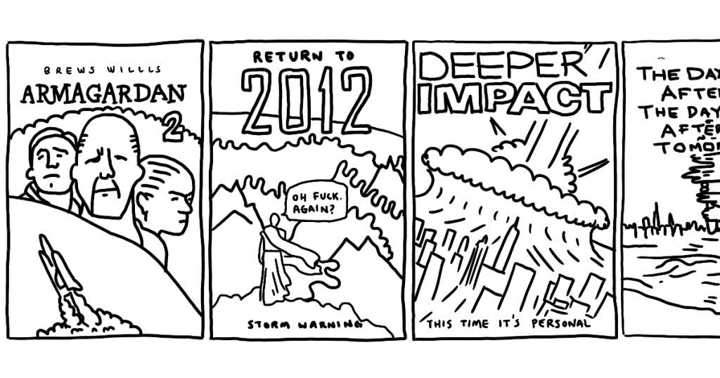
To recap: Big ideas are rare. Original ideas are often unpalatable, so, their audiences tend to be small. (Props to Captain Beefheart fans, because I can’t listen to him, no matter how original he might have been.) And most new-seeming ideas are actually remixes.
Originality is overrated (in design)
For a long while, those of us in our design studio framed the work we did with concepts. Our misuse of this term led us astray. We so wanted to cover new ground—and explore novel ideas—that the implementations failed more often than they should have. In part, I blame this on design studios like ours mistaking themselves for ad agencies.
Novelty defines ad agencies. (I don’t mean this as a put down.) They mine ideas and refashion them for campaigns that tend to run for short periods of time. So long as the current implementation captures the viewers attention, it is a success. Time is the enemy of novelty. A good campaign often works like a joke—and you can only hear a joke so many times.
Those who build brands should ignore advertising-based creative work. (That is until they’re scaling up and have a specific need for advertising.) Values and stories define strong brands. Powerful identities reinforce these values and stories. Little of this has to do with an ah-ha moment.
Punks dress like punks
Every young designer wants to break the mold. Fair enough… I did, too. Sometimes this works. For example, David Carson’s aesthetic was original. His originality was anomalous, though. The aesthetic he created only worked for a select clientele (i.e., fringe brands/tribes), at a particular time.1
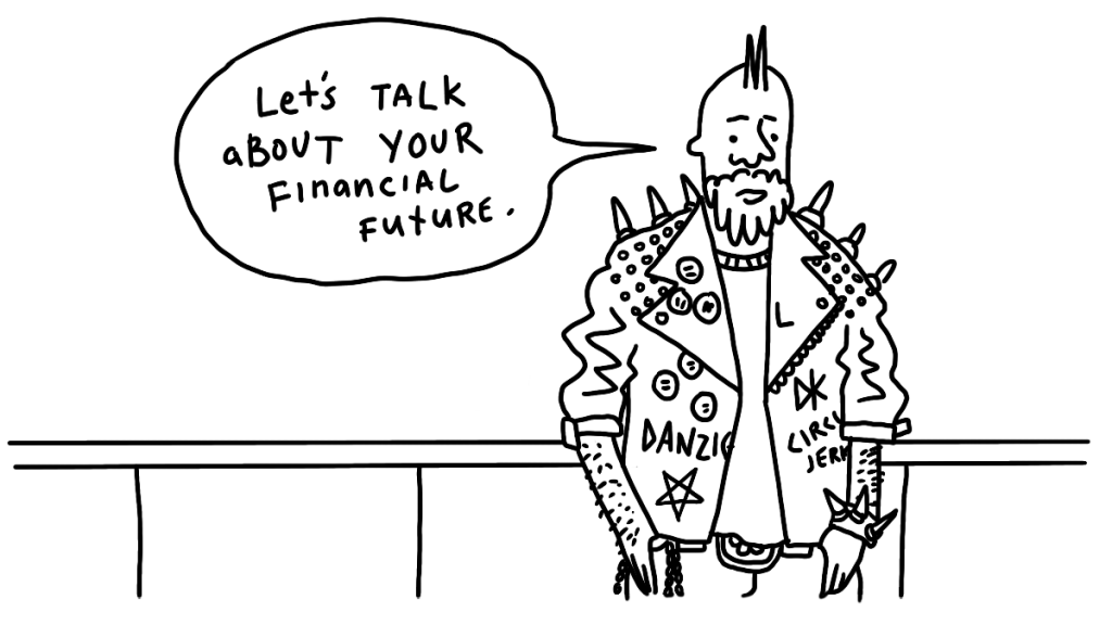
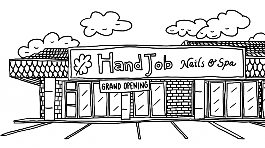
The problem with breaking a mold, is that doing so tends to cloud matters. The visual icons a company (or person) wraps itself in offer cultural cues. So, a barber pole (in spite of its weird history2) denotes where I can get a beard trim. Red checkered patterns, combined with a triangular slice, help me identify pizza restaurants. Areas filled with bright yellow or orange tell me I’m looking at a budget-friendly business. And, yes, piercings, died hair, and face tattoos give me a sense for the wearer’s politics and values.
For most designers and studios, the issue shouldn’t be about coming up with a new idea. It’s about “dressing” their clients in suitable attire. By this, I mean: treatments, color, type, language, placement, alignments, and any other element that reinforces the brand’s stories and values. This isn’t about concepts or ideas. It’s about characteristics or themes.
Get in tune
In a future post, I’ll talk about how you can better craft suitable themes. For now, I want to only leave you with one idea: As a designer (or business owner shaping a brand) think in themes—not concepts.
Ideas often relate to your ego and how clever you wish to appear. If you want to be clever, write a novel, develop a standup routine, or become an artist. Designers work in service—of their clients, and their audience/end-users. As such, your personal desires aren’t that relevant.
Framing each client’s design with a theme is a powerful approach. It forces you to consider signals and how people interpret them. It creates boundaries that guide your decision-making. It affords a framework for later implementations. Themes are like keys in music. Each one provokes certain emotions3. The designer/brand-builder’s job is to understand this, and keep the composition in tune.
Homework
Collect a slide deck containing some your company’s brand assets. These might include: screenshots, business cards, storefront signage, advertisements, pamphlets, and logo implementations. Then bring together 5 – 10 people to examine these items and talk about how each one makes them feel. If they get stuck, probe for answers. “Is this cold or warm?” “Is it cheap or expensive?” “Is it fun or serious?” After, compare these responses to your brand values and look for misalignments.
- Carson’s work is often derided, but I still admire what he did. At the time, it was brave and liberating.
- Barbers used to offer bloodletting and medical procedures, as well as haircuts. The barber’s pole, and the colors within it, symbolized these services. (Thanks to my 9-year-old’s soccer buddy, Wiley, for sharing this bit of history.)
- “It’s part of a trilogy, really…”
I’m @karj and the above is just my opinion. Looking for more? Here’s a full list of articles and information on my books. This is what I’m doing now, and what I don’t do. I’d love it if you tried Emetti on your website!